3 Essential Resume Design Rules for Non-Designers
Hi everyone. Welcome to Scholar Orbit, a one-stop global education hub dedicated to empowering lifelong learners worldwide. Through https://scholarorbit.blogspot.com, we provide access to a wide range of quality learning resources, from expert study guides and in-depth academic insights to practical skill-building tutorials. Whether you're pursuing academic excellence in school or seeking professional career advice to advance in the professional world, Scholar Orbit is here to be your ultimate guide to success. Please read on, we hope you enjoy it.
If you want your application to stand out, mastering resume design rules for beginners is the most effective way to grab a recruiter's attention before they even read a single word of your experience. Most people treat their CV like a cluttered junk drawer, shoving every achievement into a tight, unorganized space. That is a mistake.
Key Insights
- Visual hierarchy is everything; if the reader doesn't know where to look first, they won't look at all.
- White space isn't empty space; it’s a tool for guiding the eye through your professional history.
- Consistency in your typography and spacing signals attention to detail, which is a soft skill every employer craves.
The Foundation of Resume Design Rules for Beginners
Think of your resume as a landing page for your career. If a website takes too long to load or looks like a mess, you click away immediately. Recruiters spend about six seconds scanning a document. If your layout is chaotic, they will hit the back button on your candidacy.Typography and Visual Hierarchy
You aren't a graphic designer, and that’s fine. You don't need fancy icons or infographics to make an impact. Use a clean, sans-serif font like Arial or Helvetica for maximum readability. Stick to two font sizes: one for your headings and one for your body text. This creates a clear visual structure.Avoid excessive bolding, italics, or underlining. When you emphasize everything, you emphasize nothing. Use typography to create a path for the eye to follow, leading from your name to your contact info, then straight into your accomplishments.
Managing White Space
White space is the breathing room of your document. If you cram your text to the very edges of the page, the reader feels claustrophobic. Give your margins at least one inch of breathing room. Tight leading—the space between lines—is the quickest way to turn a document into an unreadable wall of text.| Design Element | The Amateur Approach | The Pro Approach |
|---|---|---|
| Margins | 0.5 inches (crammed) | 1 inch (balanced) |
| Fonts | 3+ different styles | 1-2 consistent styles |
| Graphics | Charts/Icons everywhere | Text-only, clean structure |
Why Less is Almost Always More
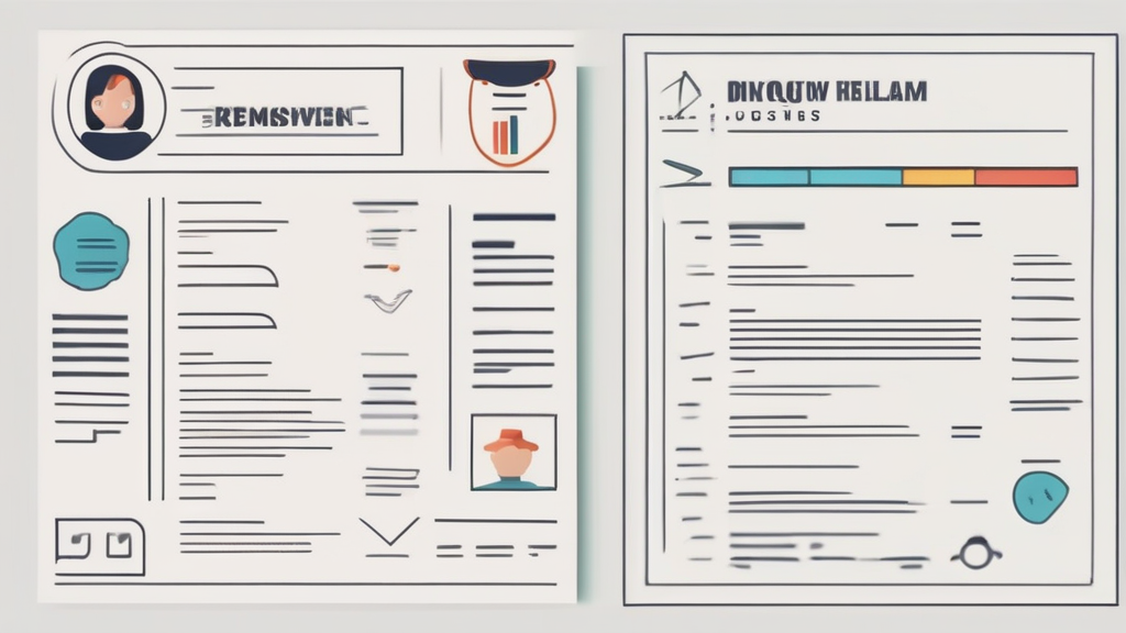
Complexity is the enemy of clarity. When you add columns, colored headers, or headshots, you often break the Applicant Tracking System (ATS). These automated bots struggle to parse multi-column layouts or images. Keep it simple. A single-column format, reverse-chronological format is the gold standard for a reason.Design isn't about making it look pretty. It's about making it work. If the hiring manager has to hunt for your job title, you’ve already lost the battle.
Consistency is Your Secret Weapon
If you bold the company name in one entry, you must bold it in every single entry. If you use a colon after your job title in one spot, do not use a dash in the next. These micro-inconsistencies scream that you weren't paying attention. A professional document reflects a professional mind. Audit your document twice for these tiny details before you export your PDF.How do I know if my design is too busy?
If you look at your resume and feel overwhelmed, your recruiter will feel the exact same way. If you have to squint to read the bullet points, increase your line spacing immediately.Should I use a template from a site like Canva?
Avoid them. Most of those templates are designed for portfolios, not for professional job applications. They are frequently incompatible with ATS software and look amateurish to hiring managers who value substance over style.How many pages should my design span?
Stick to one page unless you have over ten years of deep, relevant experience. Use your design choices to highlight your biggest wins on the top third of that single page. Stop tinkering with colors and fancy layouts. Focus on clarity, consistent formatting, and plenty of white space to let your accomplishments shine. A clean, boring resume is infinitely better than a chaotic, artistic one. Edit your document today, strip away the noise, and send out a version that respects the recruiter's time.If you've read my article, please leave a comment below so I can evaluate my website in the future so that Google will like it.
Post a Comment for "3 Essential Resume Design Rules for Non-Designers"